Music City Fencing Club Brand Identity
The Problem
I was asked to create the logo for a new club in Nashville – “Music City Fencing Club.” The client wanted to incorporate a lot of the essence of Nashville – music, culture, arts, etc,..
The Solution
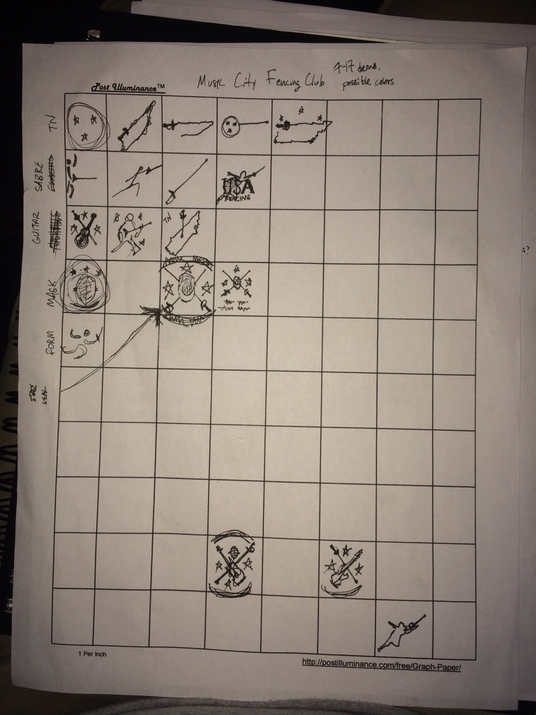
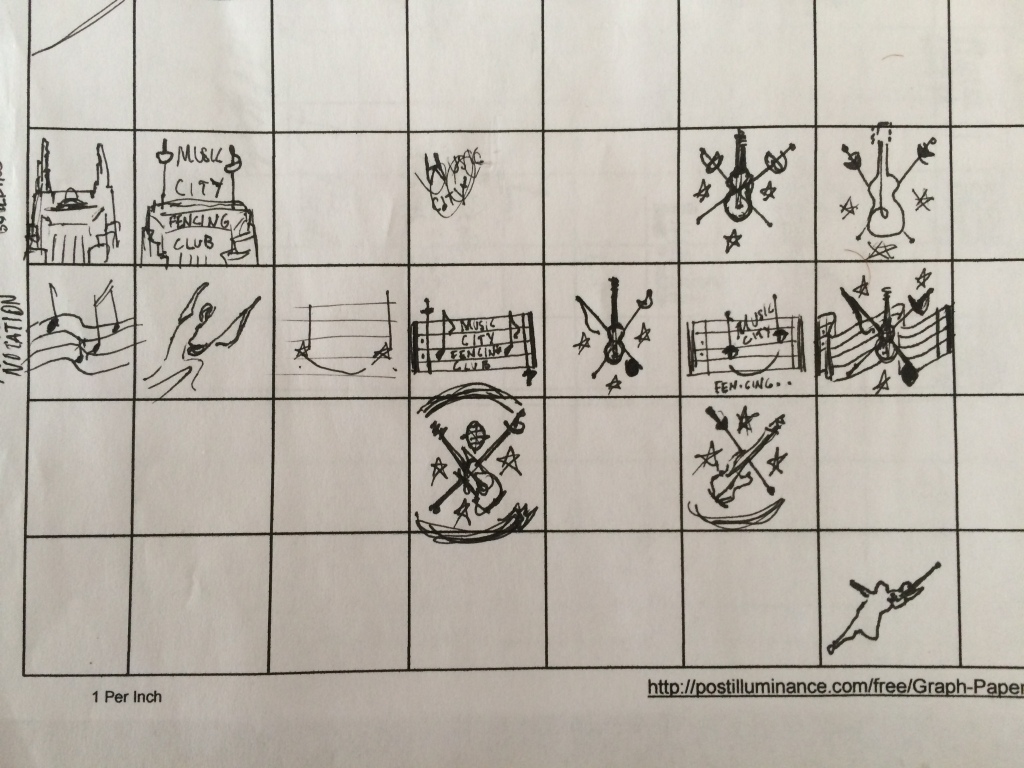
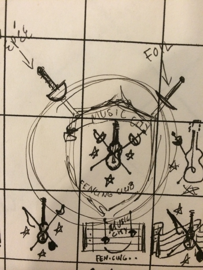
I worked closely with the founder to get him a great logo that he can use forever. We had a lot of great correspondence and I implemented a “Morphological Matrix” to brainstorm and send him progress. Here is some of that process.
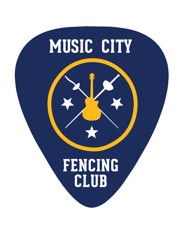
We ended up focusing in on an illustrative logo. It is graphically heavy and thus is not suitable for something like a corporate logo, but seemed to capture the attitude of his club. Due to its graphical complexity I also wanted to make sure that it scaled down nicely. Aaaand the end result!


